This is part 1 of the Math Foundations series.
Statistics starts with a simple problem: you want to know something about a large group, but you can’t measure all of it. So you take a subset and try to draw conclusions from that.
Population vs Sample
A population is the entire group you care about - every user of your app, every manufactured part, every possible coin flip. A sample is a subset you actually observe.
In practice, you almost never have the full population. You most likely will have data from 1,000 surveyed voters, but not all eligible voters. The goal of statistics is to use sample data to make reliable statements about the population.
Two things matter when sampling:
- Random sampling: every member of the population has an equal chance of being selected. Without this, your estimates are biased before you even start.
- Sample size: larger samples give better estimates. Not surprising, but how fast they improve is what makes the Central Limit Theorem interesting (a topic for a later post).
Parameters vs Statistics
The population has fixed, true values - we call these parameters. The sample gives us statistics, which are estimates of those parameters.
| Population (parameter) | Sample (statistic) | |
|---|---|---|
| Mean | $\mu$ | $\bar{x}$ |
| Variance | $\sigma^2$ | $s^2$ |
| Size | $N$ | $n$ |
The notation matters because it tells you whether you’re talking about the real thing or an estimate. When someone writes $\mu$, they mean the true population mean. When they write $\bar{x}$, they’re saying “this is our best guess from the data we have.”
Because a sample is a subset, every statistic we compute from it carries sampling error - the difference between our estimate and the true population value. Take a different sample, you get a slightly different mean. This isn’t a mistake; it’s inherent to working with incomplete data.
The standard error quantifies this uncertainty. For the sample mean:
$$SE = \frac{s}{\sqrt{n}}$$It tells you how much $\bar{x}$ would vary if you repeated the sampling. Larger samples produce smaller standard errors - the estimate gets more precise.
Standard error is the foundation for confidence intervals and hypothesis testing - topics for later in the series.
Mean, Median, Mode
Three ways to describe the “centre” of your data. Each answers a slightly different question.
Mean: the arithmetic average. Sum all values, divide by count.
$$\bar{x} = \frac{1}{n} \sum_{i=1}^{n} x_i$$The mean uses every data point, which makes it sensitive to outliers. One CEO salary in a dataset of employee incomes will drag the mean up significantly.
Median: the middle value when data is sorted. Half the values fall below, half above. Robust to outliers. For income, housing prices, or anything with a long tail, the median is usually more informative than the mean.
Mode: the most frequent value. Most useful for categorical data (what’s the most common shoe size?) and less so for continuous measurements where exact duplicates are rare.
When mean = median, the distribution is symmetric. When they diverge, the data is skewed - more on that below.
Variance and Standard Deviation
Knowing the centre isn’t enough. Two datasets can have the same mean but look completely different.
Consider two groups of five exam scores, both with a mean of 70:
- Group A:
[68, 69, 70, 71, 72] - Group B:
[40, 55, 70, 85, 100]
Same average, completely different story. Group A students performed similarly. Group B has a mix of failing and top scores. Variance captures this difference - it measures how far values typically sit from the mean.
For a population:
$$\sigma^2 = \frac{\sum_{i=1}^{N} (x_i - \mu)^2}{N}$$For a sample:
$$s^2 = \frac{\sum_{i=1}^{n} (x_i - \bar{x})^2}{n-1}$$Why $n - 1$ instead of $n$? The sample mean $\bar{x}$ is computed from the same data points, so it’s always closer to them than the true mean $\mu$ would be. This makes the squared deviations systematically too small. Dividing by $n - 1$ corrects for this bias. It’s called Bessel’s correction. With large $n$, the difference is negligible. With small samples, it matters.
Variance is in squared units (metres squared, dollars squared), which is hard to interpret. Standard deviation fixes this by taking the square root:
$$\sigma = \sqrt{\sigma^2}$$Standard deviation is in the same units as the data. A standard deviation of 5cm means something; a variance of 25cm² is less intuitive.
Skewness and Kurtosis
Mean and variance describe where the data sits and how spread out it is. But two distributions can share both of these and still look different. Skewness and kurtosis capture the remaining shape differences.
Skewness - asymmetry
$$\text{Skewness}(X) = \frac{\mathbb{E}[(X - \mu)^3]}{\sigma^3}$$- Skewness = 0: symmetric (like a normal distribution).
- Skewness > 0: right-skewed - long tail to the right. Income distributions look like this.
- Skewness < 0: left-skewed - long tail to the left. Exam scores when the test is easy tend to look like this.
The cubing preserves the sign of the deviation, which is why positive and negative outliers don’t cancel out (unlike variance, where squaring makes everything positive).
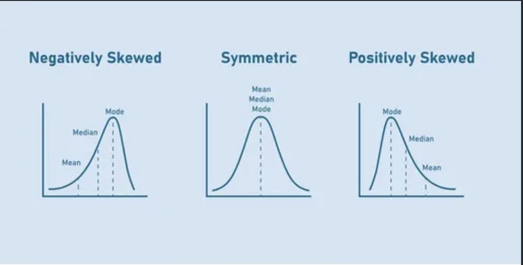 Figure 1: Skewness
Kurtosis - tails
$$\text{Kurtosis}(X) = \frac{\mathbb{E}[(X - \mu)^4]}{\sigma^4}$$Kurtosis measures how heavy the tails are. A normal distribution has kurtosis of 3. Higher means more extreme values than you’d expect from a normal; lower means fewer.
In practice, you’ll see excess kurtosis reported (kurtosis minus 3), so the normal distribution sits at 0 as a baseline. Financial returns are a classic example of high kurtosis - market crashes and spikes happen more often than a normal distribution predicts.
Quantiles and Box Plots
Quantiles split your data at specific points. The $k\%$ quantile is the value with $k\%$ of the data below it.
The most common ones:
- Q1 (25th percentile): one quarter of data below
- Q2 (50th percentile): the median
- Q3 (75th percentile): three quarters of data below
The interquartile range (IQR) = Q3 - Q1, covering the middle 50% of the data. It’s a robust measure of spread because it ignores the extremes.
A box plot summarises all of this visually. The box spans Q1 to Q3, a line marks the median, and whiskers extend to the most extreme points within 1.5 × IQR of the box edges. Anything beyond the whiskers is plotted as an individual point - a potential outlier.
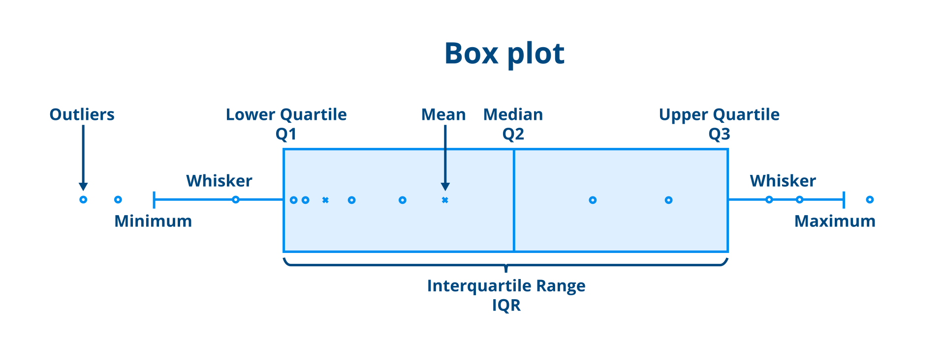 Figure 2: Box plot anatomy
Box plots are most useful when comparing distributions side by side. One glance tells you which group has a higher median, more spread, or more outliers.
Tying It Together
These measures form a toolkit. In practice, you rarely look at just one:
- Mean + standard deviation work well for symmetric, well-behaved data.
- Median + IQR are better when outliers are present or the data is skewed.
- Skewness tells you whether the mean and median will agree.
- Kurtosis warns you about tail risk - important in finance and anywhere extreme events matter.
When you get a new dataset, computing these first gives you a quick picture of what you’re working with before reaching for anything more complex.
Population vs Sample - Formula Reference
| Measure | Population | Sample |
|---|---|---|
| Mean | $\mu = \frac{1}{N} \sum_{i=1}^{N} x_i$ | $\bar{x} = \frac{1}{n} \sum_{i=1}^{n} x_i$ |
| Variance | $\sigma^2 = \frac{\sum_{i=1}^{N} (x_i - \mu)^2}{N}$ | $s^2 = \frac{\sum_{i=1}^{n} (x_i - \bar{x})^2}{n-1}$ |
| Standard deviation | $\sigma = \sqrt{\sigma^2}$ | $s = \sqrt{s^2}$ |
| Proportion | $p$ | $\hat{p} = \frac{x}{n}$ |
The only formula that changes between population and sample is variance - dividing by $n - 1$ instead of $N$. Everything else follows the same logic.
Next up: Probability basics - the rules that govern uncertainty, and why they’re the foundation for everything from hypothesis testing to machine learning.